Feature 01
Data visualization that builds trust
Problem
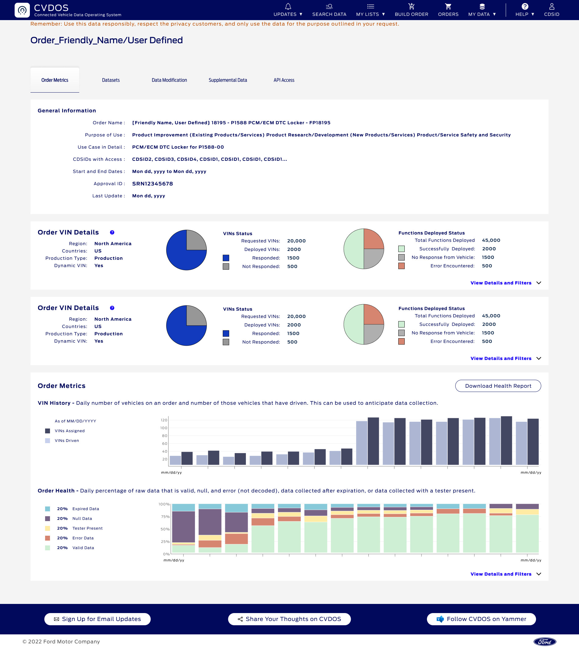
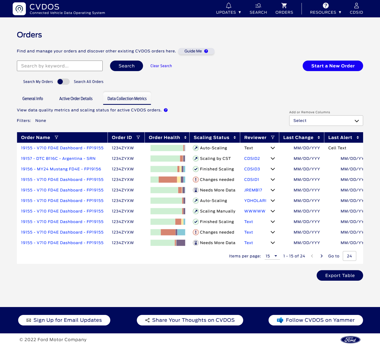
Submitting a request was only half the job — teams also needed to understand whether data was arriving, whether deployment was healthy, and where issues were emerging.
Decision
Designed an order-health view that paired high-level status summaries with trend charts, so engineers could scan overall health first and then drill into details and filters only when needed.
Tradeoff
I prioritized fast interpretation over dense analytics on the main screen, using simple visual breakdowns and clear labels instead of overwhelming users with every possible metric at once.
Outcome
The platform made request health legible: VIN status, deployment status, and raw-data quality could be reviewed in one place, increasing user confidence in what the system was doing.